
Process
The task became particularly challenging when striving to preserve the original typeface style as a foundation while ensuring uniform letter thickness and evenly spaced lettering. Leveraging Procreate and the Adobe Creative Suite, the logo underwent tracing and subtle adjustments, notably enhancing the boldness of the letters, with significant proportional changes observed in the J and R characters.
The new logo is currently being used for all future promotional content, including trips, parties, fellowship advertisements, and weekday activities.
The new logo is currently being used for all future promotional content, including trips, parties, fellowship advertisements, and weekday activities.
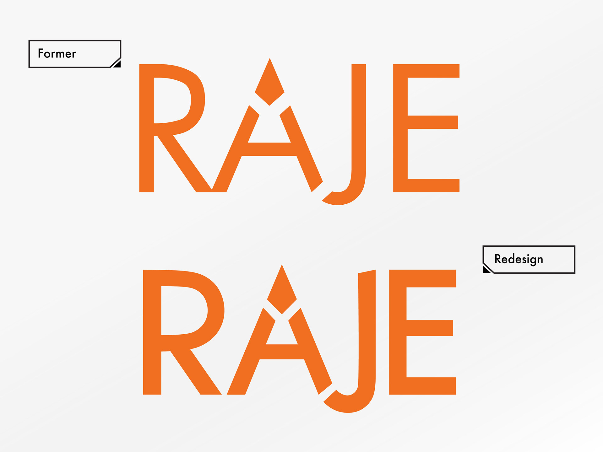
Comparison between the former and newly redesigned logos for Russian American Jewish Experience (RAJE)

Color options (as requested by client)
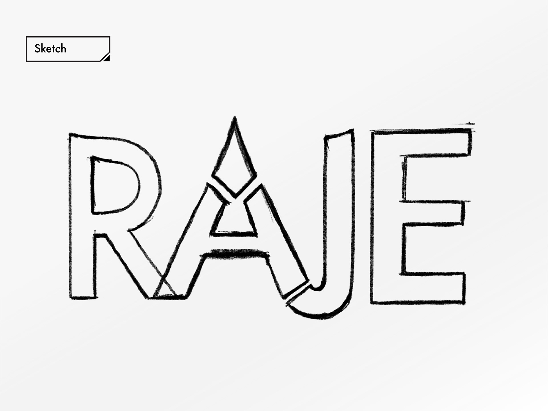
First Draft (Procreate)
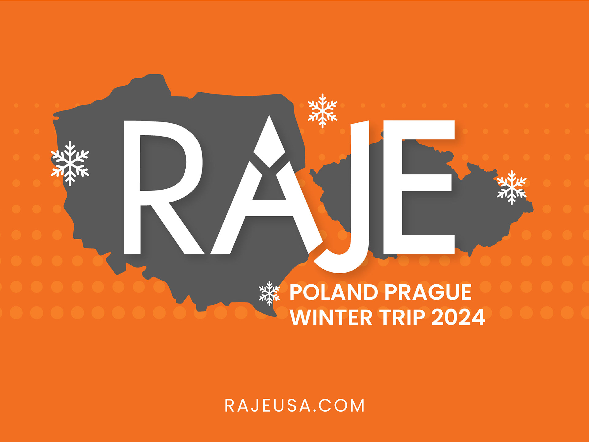
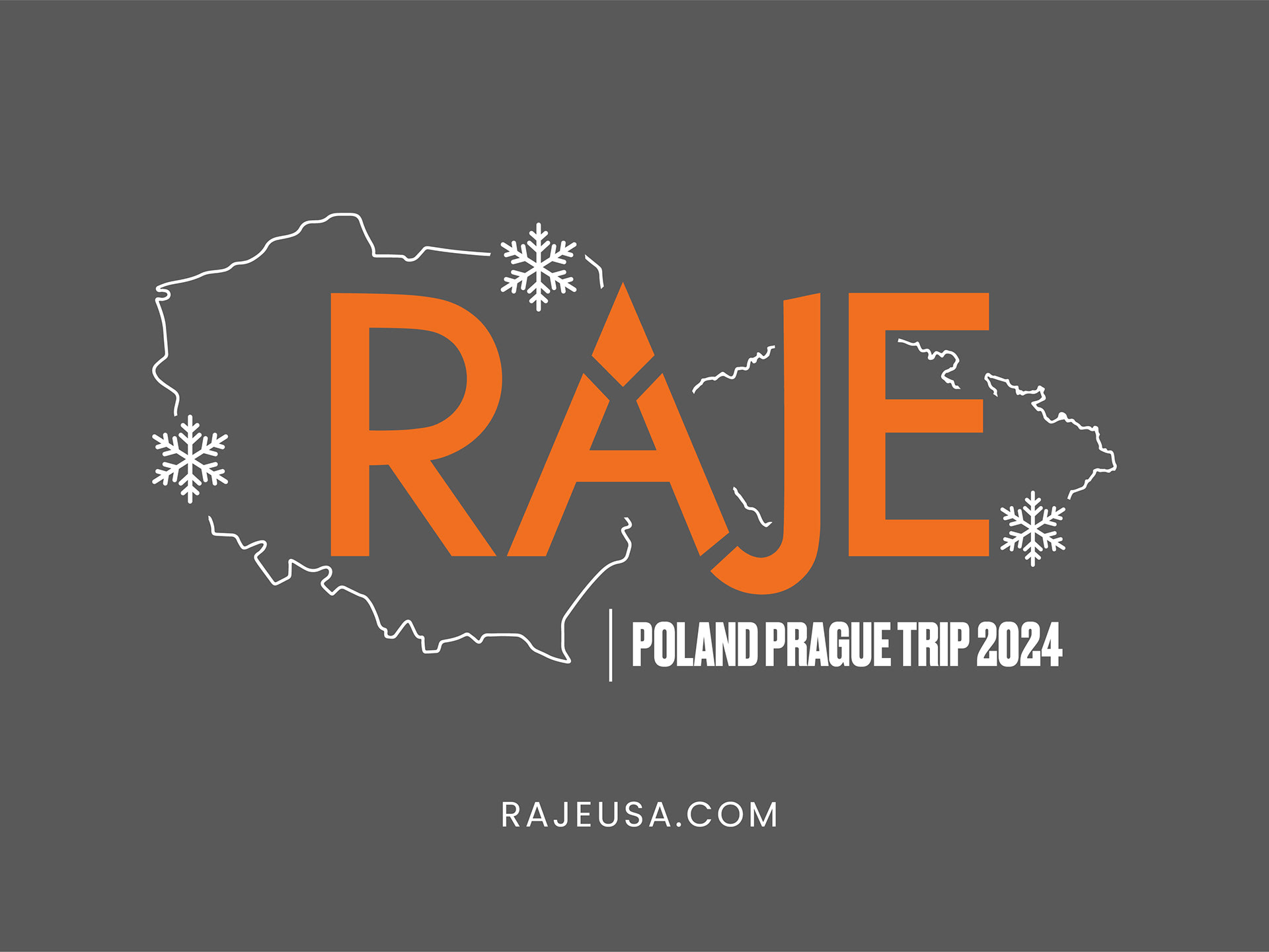
Hoodie Design
As part of the ongoing redesign project, the task was assigned to develop a composition for printing onto long-sleeved unisex hoodies, intended for over 40 individuals on a journey to Poland and the Czech Republic's capital, Prague. Addressing this aspect of the project involved optimizing the silhouettes of both countries as framing elements while integrating a metaphor that evokes a winter-themed excursion without detracting from the logo. The designated color scheme emphasized shades of gray and orange, with the additional option of incorporating black or white as a tertiary color.
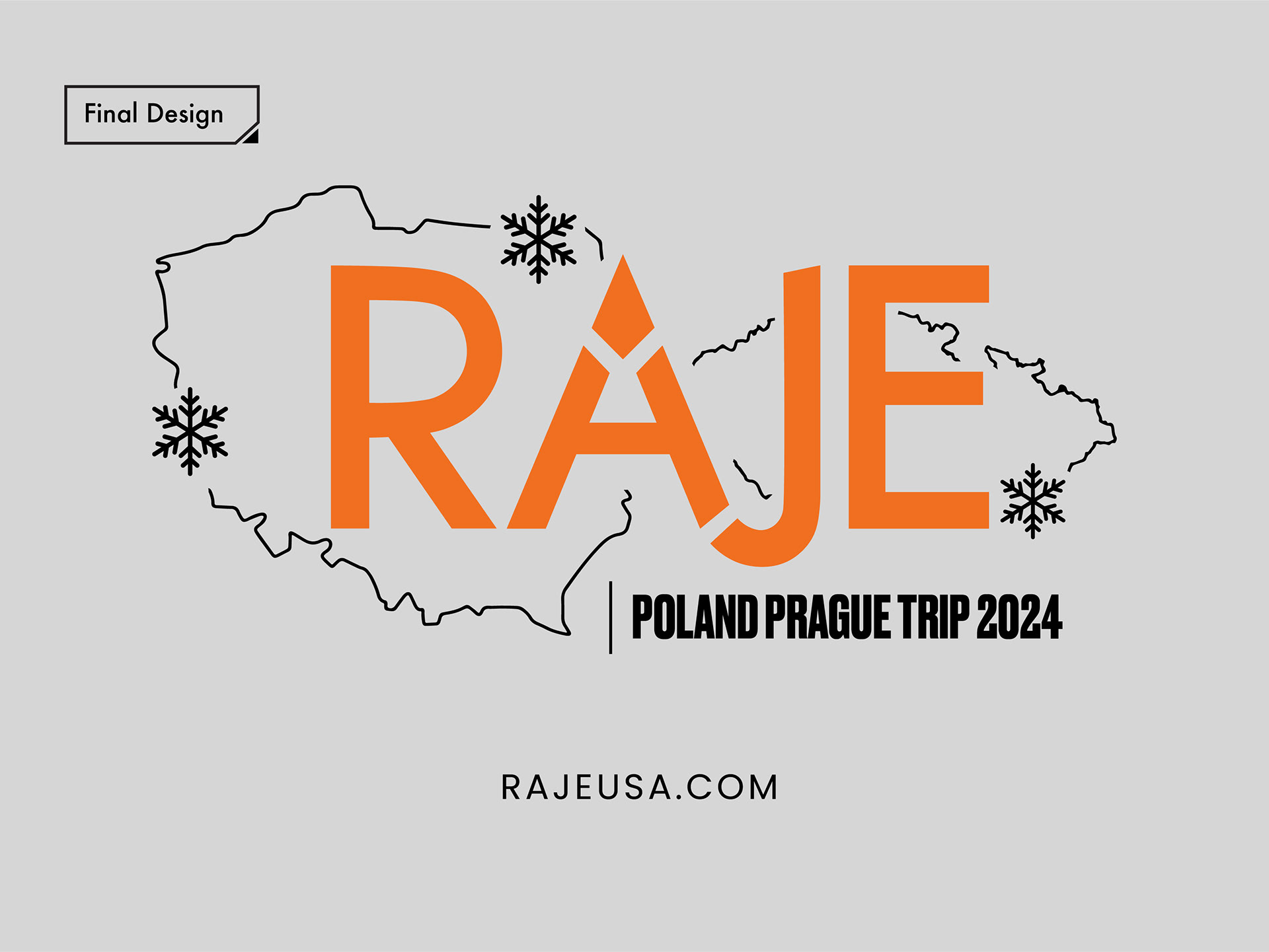
Additional Options


Hoodie Design (back of the shirt)
